Subway Disruption Model
A reproducible pipeline and classifier that ranks which NYC subway lines are most likely to post a delay alert in the next hour — with an honest verdict on whether it's good enough to use.
Team project note: Built with Robert Corona. The pipeline, model evaluation, and both published pages are shared work; the work described below is what Andy owned or co-owned.
Overview
Context
A two-person research project with Robert Corona, built from the MTA's public service-alert dataset (2021–2026, about 1.05 million line-hours). The question was narrow on purpose: can recent alert history rank disruption risk one hour ahead, and should anyone act on it?
The problem
What it needed to solve
The MTA publishes every service alert as open data, but nothing turns that history into a forward-looking signal. And a naive model would cheat: it's easy to leak information from the future into the training set and get numbers that fall apart in production.
Define an auditable target (an unplanned delay or suspension alert starting within the next hour), build leakage-safe features that only use what was known before that hour, train and compare three classifiers on a strict chronological split, and publish the results as a page anyone can read — with the real model embedded so visitors can try it.
Contribution
My role in the work
- Built the data layer: a downloader that snapshots the Socrata dataset with a SHA-256 manifest, and a layered SQLite build that turns raw alerts into a labeled line-hour table.
- Wrote the SQL that defines the target and the as-of features — trailing alert counts, 7- and 30-day disruption rates, hours since the last incident — every one computed strictly before the prediction hour.
- Trained and compared a historical-rate baseline, logistic regression, and gradient boosting on a 70/15/15 chronological split, tuning the threshold on validation only.
- Exported the 300-tree model to JSON and wrote the browser-side inference that traverses it exactly, verified against scikit-learn at export time.
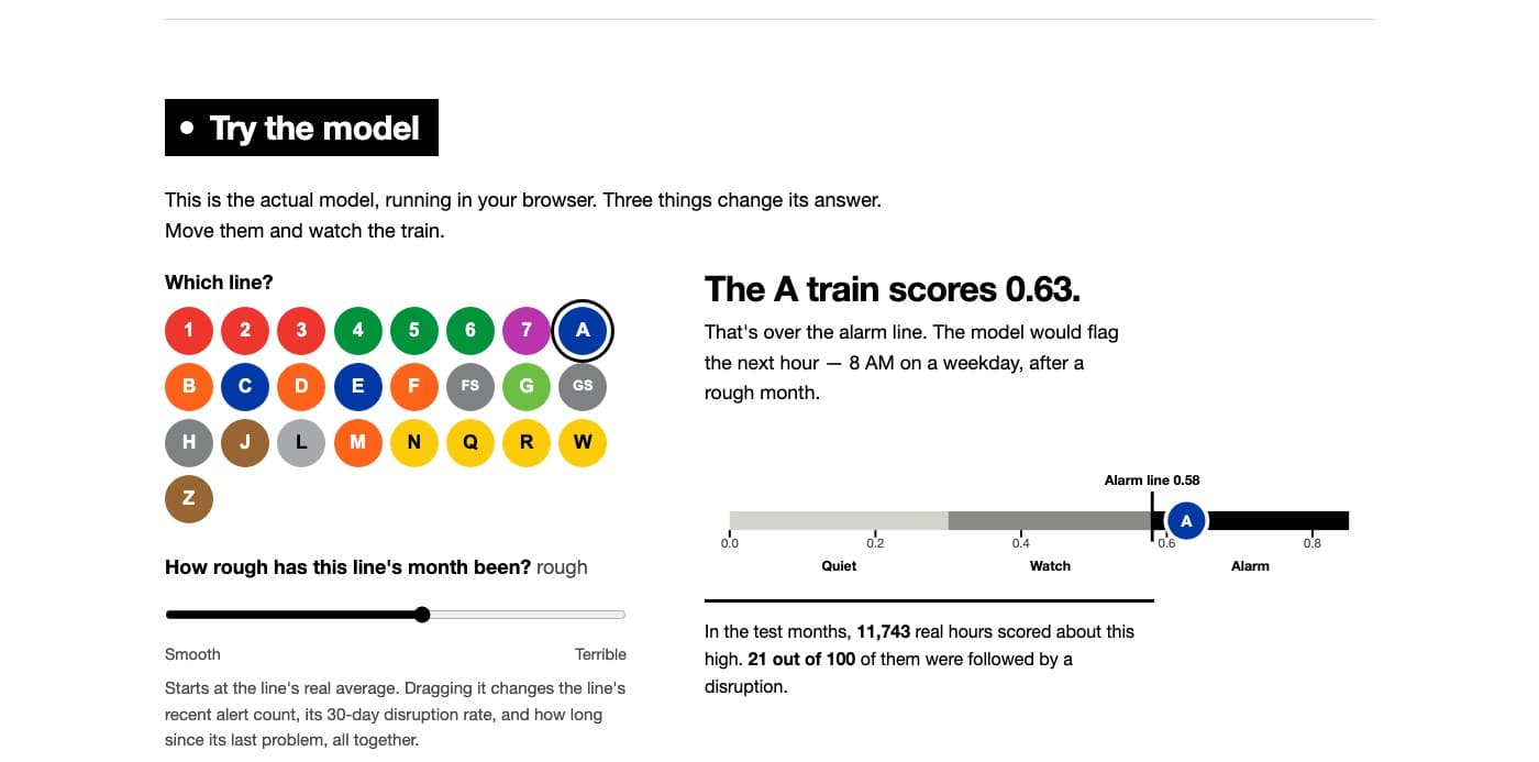
- Designed and built the two published pages: a plain-language explainer with a three-control demo, and a full research brief with threshold and feature explorers.
- Wrote the test suite and the GitHub Actions workflow that publishes the site on every push.
Decisions
Key decisions
- Chose a customer-facing proxy (a delay alert is posted) over an unobservable ideal (a train is actually late), and documented exactly what the label does and doesn't capture.
- Split by time, not at random. A random split lets the model see the future and inflates every metric; the chronological split is what made the honest result possible.
- Reported the result as ‘useful for ranking, not good enough for rider alerts.’ At the published threshold the model finds 63% of disruptions but three of four alarms are false — a real finding, stated plainly rather than buried.
- Embedded the actual model in a static page instead of standing up an API. There's nothing to keep running, and the numbers a visitor sees are the numbers we reported.
- Wrote the front page for a general reader — one rule, three controls, two waffle charts — and kept the dense brief one click away for the reviewer who wants every number.
Implementation
How it was built
- Python 3.11 CLI (mta-alerts download | build | review-sample) over a standard-library-only runtime with SQLite; the ML step adds pandas and scikit-learn.
- Layered SQL: staging, deduplication, schedule-based eligibility, then a feature table keyed on (line, hour).
- Gradient boosting classifier exported as a JSON tree bundle; a ~60-line JavaScript scorer reproduces scikit-learn's traversal including missing-value routing.
- Two generated HTML pages, built from templates by a single script so the numbers on the page can't drift from the exported metrics; pytest checks the published metrics reproduce from the exported score histogram.
- GitHub Actions deploys both pages to GitHub Pages on push.
Outcome
What exists today
A live site where anyone can read what we tried, pick a subway line, and watch the real model score it — and a written conclusion that the model ranks risk about 1.65× better than chance, which is interesting research and not a product.